By Nancy Martin
Last year, I published the first book in a new mystery series starring Roxy Abruzzo, a streetwise tough girl from Pittsburgh who helps people who can’t go to the cops when the chips are down.
Let me be honest: The book didn’t sell as well as everyone hoped.
Why not? Lots of reasons, I think. We’re hitting the re-set button for Roxy in 2011 with a re-packaged paperback of the first book (re-titled, new cover, new blurbs) and a second book in the series in which I made some writerly changes, too. The main thing the publisher wanted to change was the cover art.
Here’s the first book, in its first incarnation, which you can see they tried to package as if it were a big novel by a brand name author:

Brand name authors are authors whose name alone sells the book. (When you browse bookshelves in airports, all you see are the author names. No cover art shows at all.) Who cares what a Robert B. Parker cover looked like? It was his name alone that sold his books. Although, I gotta say, I loved some of his simple, high concept cover art--a single image on a colorful background--such as this one:

And here’s the re-package of OUR LADY, in trade paperback. (And due in stores next Tuesday, January 18th.) As you can see, the publisher decided my name was nice enough, but maybe not sufficiently well-known to sell books the way our beloved Mr. Parker did:
What do you think? I like this cover because it’s clearly a book written for women, which it is. (Is a man going to pick up a pink book?) Plus I love the dog, and cute dogs sell, right? This cover also conveys a certain sense of humor without screaming; “We think this author is just like Janet Evanovich!” Which is a lovely sentiment, but not remotely true because there is only one Janet Evanovich. May she reign forever.
Covers are tricky territory for authors. We don’t usually have any input in cover art. (Not unless you’re working with a “small press” where cover approval is one asset that doesn’t cost the “publisher” any money at all and therefore is given—uh---freely.) At traditional houses, editors usually send you a pdf file with your cover along with an accompanying email that cheerily says, “We love this cover! We think you will, too!” Which, if you open the pdf file and groan with dismay, doesn’t give you much room to disagree. Besides, when you’re new at a particular publishing house, you don’t want to blast through the front door shouting, “This cover stinks!” You want to be a team player. You want to let the experts to what they do, and you hope for the best.
Over the summer, though, I did voice my dismay at some of the attempts at cover art for the second book in the series. Politely. But firmly. Making my case, being very specific about what didn’t work, not being insulting because, after all, I’m a writer, not an artist. (But because I’m a writer, I’m also a little obsessive.) My agent got involved. (The Rottweiler. She’s firm. Really firm. And maybe the savviest person I know in publishing. I’d trust her instincts anytime. And I do.) During the negotiations, my editor ran interference with the art department, the sales department, the publicity department, the paperback division, plus assorted executives—all of whom had opinions. She had a tough, tough assignment remaining friends with everybody and getting the job done. In the end, everyone was really pleased with the results.
If the book fails a second time, the fault lies with one person: The author.
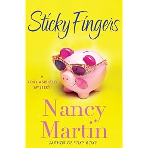
When I realized OUR LADY OF IMMACULATE DECEPTION (which is now called—for better or for worse—FOXY ROXY) wasn’t exactly a hit with readers, I immediately began tinkering with the second book, which we titled STICKY FINGERS.
The publisher made an honest effort to re-think what kind of brand they wanted Roxy to be and how to convey that with the cover. I did some re-thinking, too. Gone is the multiple POV in favor of (my preference) first person, which I believe makes a character much more intimate with the reader from page one. The second book isn’t as dark as the first. It has more situational comedy.
Gone also is the element that icked out most cozy readers—Roxy’s eagerness to take off her panties. (Am I revealing too much, do you think? Heck, we’re all writers, right?) No, she’s not a new character, but she did have a hell of a wake-up call in Book One, so her change is well-motivated. If her character is going to grow and change in a believable way—a trend among mystery protagonists that I prefer--this was one important place to start. Readers, I’m sure, will be very quick to let me know if you think I handled it in a way that works.
Meanwhile, what’s your opinion on covers? Have you chosen a book lately, by cover alone? I chose this book—by an author I didn’t know at the time—simply because of the cover:

How about you? Do you very buy because you like the cover? Tell, tell.
23 comments:
trenne
Nancy, you are a brand name author to some of us!
I admit it. I've been seduced into buying books based on cover art alone, but I can't think of an example at the moment. Maybe after coffee.
I'm looking forward to the next Roxy book but I have to confess that Roxy's inappropriate sexual behavior was one of my favorite things about her. Who wouldn't want to get it on with that young guy in the truck? Most of your regular readers, I guess.
Best of luck on the newest one.
For some reason, blogspot printed the magic word - trenne - at the top of my comment. Let's see if it does it again. The word this time is: piatorw.
I have never purchased a book based on the cover, but I certainly have picked one up and then investigated further to decide whether to purchase it based on that cover. I still read summaries,blurbs and the first line before commiting -- I'm old-fashioned that way. I like your new cover(s) a lot and predict great success!
Welcome back, Nancy! Does everyone know Nancy was one of the original Working Stiffs? She wrote the very first post way back in 2006.
I like the new covers and the new title for the 1st book much better.
What I'm most excited about, though, is that there's another Blackbird book coming up.
I haven't bought any books because of the cover, but I've certainly picked a few off the shelves and read the cover copy.
Good to see you back here, Nancy!
I can't recall ever buying a book because of the cover, but that doesn't mean I don't appreciate what works of art some of them are.
I'm like Gina in that I rather enjoyed Roxy's wild ride in the first book. Ah, well...
Looking forward to seeing what you've done with Roxy in the next book.
I ditto PatR's comment word for word.
About that Jennifer Weiner cover, which I like, but playing devil's advocate a bit--I wonder how that cover would be regarded if it showed the legs of a man?
You are all very sweet. (2006?? That's how long ago??)
The Sisters in Crime reader study came out this week, and cover art still ranks very high among the influences readers obey when buying books. Perhaps that will change as e-books become more popular. Meanwhile, covers matter--a lot. What can authors contribute to the cover? Good copy, good blurbs (hey, we have to find our own these days!) and good title suggestions. We can speak up about the art, too. Carefully.
Oh, Nancy, did this post ever ring true to me! I nearly fainted when I saw the cover for FED UP. Neon yellow with a close-up of a deli counter loaded with bloody meat. Hideous beyond belief. And I had the exact email you described from the pub: "We're so thrilled with this cover and hope that you are just as pleased with this disgusting thing as we are!" Well, something like that.
Waving at Nancy!
Even though we think we aren't influenced by cover art, I think we have to be, at least subliminally. Look at the difference in the covers of say, Nancy's Blackbird Sisters series, and any cover of Lee Child's. I'm much more drawn to the mood of Nancy's covers than the dark and dramatic ones. And I think it's purposeful on the part of the publisher; it signals to the potential reader what is inside the book.
Again, think of the difference between the covers of Jennifer Crusie's and Emily Griffiths' books, vs. those of Robert Crais of Harlan Coben. You instantly recognize the genre of these covers, and no one would mix them up.
Agree? Disagree?
Aaacck. Should be "OR Harlan Coben".
Hi, Karen! Covers certainly signal sub-genre to readers. (Remember the years of kid jep? Every cover seemed to feature a highway or amusement park in the background--but also an abandoned child's shoe in the foreground. Readers knew exactly what kind of story they were getting.)
But sometimes covers can look dated. I'm hoping the new Roxy cover signals a lot of story elements--but also looks current and modern. And unique.--I don't want readers to think they're buying a Blackbird book, but something very different.
Jessica, I went over to Amazon to see your cover. Okay, it's not exactly pretty, but it definitely signals "cozy mystery" to buyers. The font, the detailed picture, even the colors indicate it's a specific kind of mystery. I think readers who love that kind of book are going to make a beeline for it.
With the Roxy series, we're trying to establish a totally new brand, I guess. One reviewer called it "chick-a-boom-boom," which is weird, but okay by me, I guess. Does the cover indicate that kind of story?
Go look at today's Amazon bestsellers. What do you think of the covers? Many seem to be simply advertising the brand name author. Very few appear to signal story elements. Interesting. Bad for midlist, authors, I think, who are still building their brands.
(Ye gods, have we come to brand-building as writers??)
I never buy a book because of the cover but it might make me pick it up and read the back in inside flap.
Hi, Nancy! I'm excited that the 2nd Roxy is on its way and would buy it regardless of the cover :) Like many, cover art influences my browsing, as I've been "trained", I suppose, to associate certain types of art with certain types of books. Cover art, then, is a quick proxy for content and useful to make those crucial first cuts on what to investigate further and what not to.
I actually tend to shy away from chick-lit style covers as it's not my favorite genre. I do like some authors, though, and follow them faithfully.
Your point about covers for best-selling authors is well taken and interesting. With the name being the focus, does the quality of the art itself suffer? If you don't need great art to draw the eye, does it become less important? Certainly as I think about my own browsing experience, it's the less-known and first-time authors whose covers I tend to find most interesting.
Great discussion!
I never buy by cover either, but I do agree cozy covers do state specifically what the genre is.
Jessica, I too ran over to Amazon to see your cover. I don't see bloody, red yes, but not bloody.
So, another thing about covers is when they give you false impressions. My first thought was that it was about a deli owner.
And, Nancy, if I didn't already know what your books were about, I'd be stumped at seeing a piggy bank.
Personally, I think covers are the biggest headache whether we design them ourselves, as I did, or they are done for us. But I'd never want to not have some imput.
Patg
You're not the only one "stumped," I fear, Pat.
Kerry, yes, I think the art of a cover becomes routine if the author's name is sufficiently well-known. When my favorite authors pub a new book, I don't care what it looks like. It's midlist and/or unknown authors who really need covers that seize the consumer's imagination. How do we have input? Sometimes it's by writing a book with great set pieces, unique characters or settings that immediately make sense to the cover artist first, sales dept second, and of course the consumer.
I love the new covers - didn't necessarily mind the original, but the new ones are cuter! - and I'm so happy that Roxy gets to go to first person now, and also that she doesn't continue to sleep around. Sorry if that makes me sound prudish, but I had a problem with it. Best of luck with the rerelease, and I'll definitely be picking up the sequel when it comes. I'd have done that anyway, because of A) the author name (second Joyce here; you're on my must-buy list) and B) the cover (which really is awesome and which would have caught my attention even without the name!)
Hi Nancy, Great to see your post--and even greater that we've got another Roxy novel on the way!
Like many of the other commenters I don't make the decision to buy a book based solely on the cover, however it is definitely part of what attracts me to pick up a book and read the back copy blurb and the opening pages.
Your post is very timely for me personally! When my publisher invited me to provide materials to their art department that would help them come up with cover art for my first novel, I readily agreed. In fact, I took the liberty of having a graphic artist friend work up a whole cover based on my concept. Of course, I loved it. My agent loved it and so did my editor. The problem was the publisher didn't love it quite so much. They wanted something that was warmer and more accessible to women readers. I received their new version this past Monday. While they've put together a beautiful cover, it's hard stepping away from the vision I have as the writer. But I'm a writer, not a graphic artist and certainly not an expert the kinds of bells and whistles sell books.
At this point, I'm not sure if I'll be allowed any input and being a first timer, I'm loathe to rock any boats. But I have spent the last few days obsessively studying book covers and trying to figure out what attracts me and why. It's a complicated business...
It's very complicated, Meredith. And frankly, I think the most important people who must love the cover are the folks in the sales department. They're the ones who must sell the book (we hope in large quantities!) into chains and stores. If they don't "get" the concept via the cover, they can't sell it. And if they don't love the cover---it's only human nature not to convey that to buyers.
By "cover," of course, I mean more than the art. It's title, the author's name, blurbs, cover copy, reviews--the whole enchilada. And authors do have some say on many of those elements. And we're supposed to be good communicators, so we should spend time (early in the process!) figuring out what we want on the cover so we can convey that to the publisher.
Thanks for having me here today, Stiffs! It's nice to be among good friends.
Nancy,
I like the new cover much better, and Sticky Fingers fits with it. I hope it flies this time, because it was a good book!
I admit I do pick up a book if the cover catches my eye, but I also read the back blurb to see if it sounds like something I would like to read. So....I would have to say the cover can be VERY important to catch the eye of new readers. BTW, I'm a new fan of your books, Nancy! ;0
Me, I usually skip the back cover copy. Instead, I read the first page of the first chapter. (And--personal preference here--if it's in italics, I put the book back on the shelf!)
Post a Comment